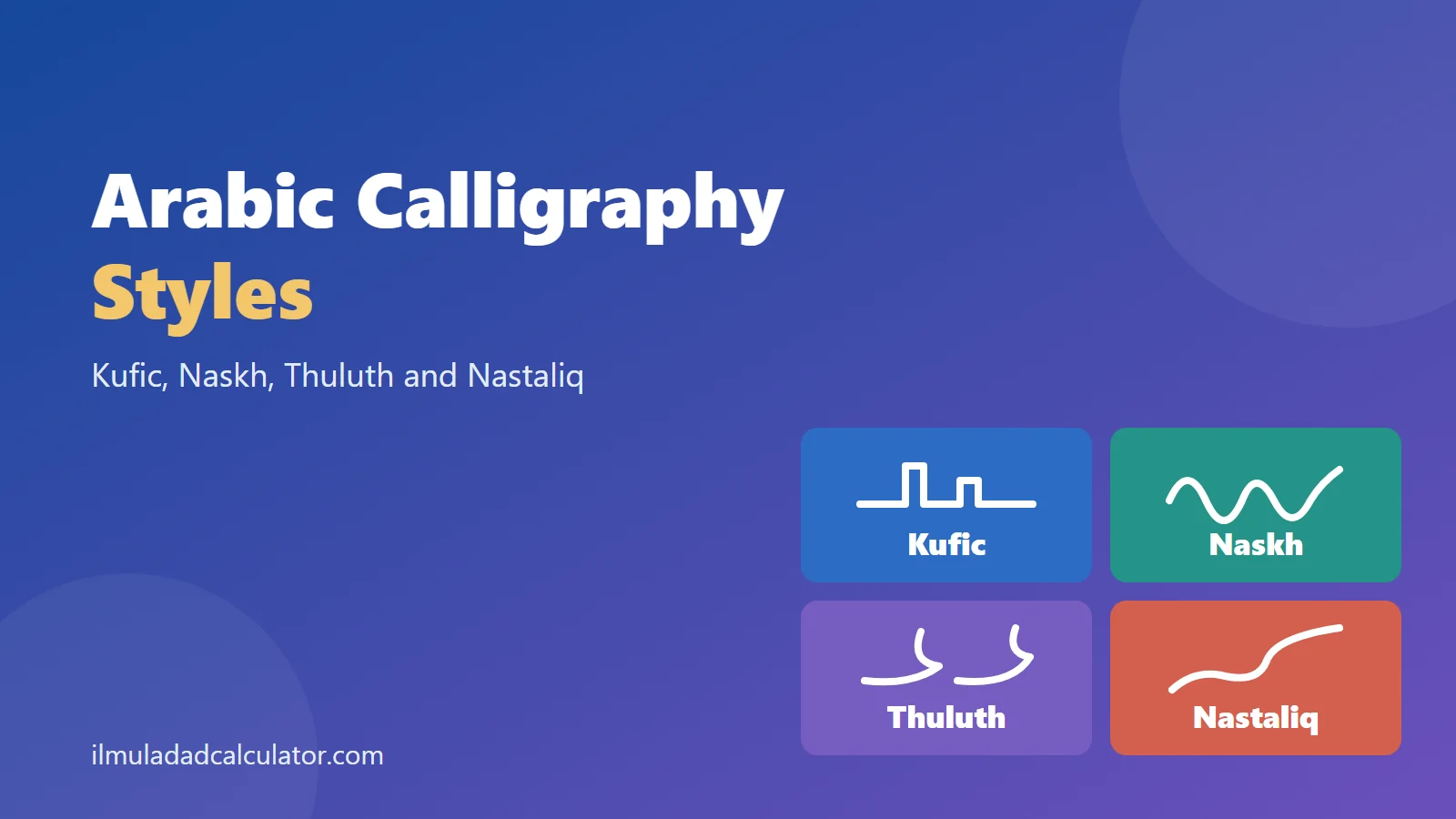
Arabic calligraphy is the art of writing the Arabic script by hand. Its main styles are Kufic, Naskh, Thuluth and Nastaliq, and each has its own period, region and look. This guide shows how to tell them apart at a glance.
What Are the Main Arabic Calligraphy Styles?
A calligraphy style, called a khatt in Arabic, is a set of rules for drawing the same letters. The rules cover the pen, the size of the letters and the slope of the strokes. The alphabet itself does not change, as you can see on the Arabic script hub.
Museum guides often split the styles into two groups. The angular group is called Kufic. The cursive group includes Naskh, Thuluth, Nastaliq and several others.
The bars show that the styles overlap in time. Writers did not drop one style when another appeared. They kept each style for the jobs it did best.
Where and When Did Each Style Develop?
The table gives the period and region reported by museum and library sources. Dates are approximate, because scripts changed slowly and scholars place the starts a little differently.
| Style | Period | Region | Typical use |
|---|---|---|---|
| Kufic | Perfected in the second half of the 8th century | Iraq, named after Kufa | Early manuscripts, stone and tile inscriptions |
| Naskh | 10th century | Across the Arab world, refined in Ottoman Turkey | Books, printing, everyday text |
| Thuluth | Early Islamic period; refined in the 15th century | Mamluk lands and Ottoman Turkey | Titles and building inscriptions |
| Maghribi | 10th century | North Africa and Spain | Manuscripts in the western Islamic world |
| Nastaliq | 14th to 15th century, with roots in the 13th | Iran, later India and Pakistan | Persian and Urdu poetry and books |
| Diwani | 16th century | Ottoman court | Official documents |
| Ruq’ah | Later 18th century | Ottoman lands | Handwriting and letters |
A note on names: Kufic is named after the city of Kufa. One guide says the style did not necessarily begin there. Treat the name as a label, not a birthplace.
How Can You Recognize Each Style by Eye?
Start with the whole line, not single letters. Look at the baseline, the slope of the strokes and the size of the text.
Kufic
Kufic is angular and sits on a flat horizontal baseline. Its vertical strokes are short and broad, and its horizontal strokes are long. Early examples often have few or no dots.
Later builders added leaves, knots and braids, and squared the letters to fit walls. Because the forms get so ornate, some Kufic panels are hard to read even for experts.
Naskh
Naskh is small, round and even. Its name comes from a verb meaning to copy, which fits a hand made for books. Descending letters end in an upward hook, and the shapes are clear and quick to write.
Thuluth
Thuluth is larger and more stately. Its vertical strokes lean to the left, its horizontal strokes curve deeply, and the letters often interlace. Its name means one third, and one guide suggests this refers to the pen size.
It is often paired with Naskh, which works as a smaller companion script. You will see Thuluth on titles and Naskh on the text below.
Nastaliq
Nastaliq looks like a flowing slope. Its verticals are very short, its horizontals are broad and sweeping, and its letters seem to hang across the page. It slants to the right, while the other cursive styles in the museum guide slant to the left.
Lines of verse are often set on a diagonal, which adds to the floating look. The name is thought to blend naskh and taliq, an older Persian hand.
Kufic Has Many Sub-Styles
Kufic is really a family. Museum writers list early Kufic, Eastern Kufic, Foliate Kufic, Knotted Kufic and Square Kufic.
- Early Kufic is the plain, bold form of the first centuries.
- Eastern Kufic has slender, slanted strokes and was popular on ceramics.
- Foliate Kufic adds leaf shapes to the ends of strokes. It was common on buildings from the 10th century.
- Square Kufic fits letters into a grid. It grew in the 13th and 14th centuries and could cover entire walls.
Which Style Is Used for What Today?
Each style kept a niche, even though computers now set most text. These are the usual roles.
- Naskh is the most common style in printed Arabic. Typesetters adopted it because it is clear at small sizes.
- Thuluth appears on titles, panels and building inscriptions, usually in a larger size.
- Kufic is mostly decorative today. It still appears in titles and in architectural inscriptions.
- Nastaliq is the traditional hand for Persian and Urdu. Pakistani newspapers, books and signs have long used it.
Pakistani readers meet Nastaliq every day without naming it. The page on Nastaliq vs Naskh compares the two in more detail. The Urdu alphabet in order shows the letters themselves.
What About Diwani, Ruq’ah and Maghribi?
Three more styles come up often when people look at calligraphy. Each has a clear home.
- Diwani began in the Ottoman chancery in the 16th century. Its lines rise from right to left, and its large form fills gaps with small dots.
- Ruq’ah developed in the second half of the 18th century for Ottoman office work. It is plain, straight and quick, so it is common in modern handwriting and signs.
- Maghribi means western. It grew in North Africa and Spain, and its descending strokes make wide, sweeping bowls.
One guide notes that the large form of Diwani was hard to read on purpose. This helped protect official papers from forgery. It is a historical detail and does not apply to everyday writing.
Who Set the Rules for the Cursive Styles?
The Library of Congress credits Ibn Muqla (855 to 941) with standardizing Naskh inside a system of proportions. His system included six scripts, and Thuluth is one of them.
Two later masters are named in the same account. Ibn al-Bawwab, who died in 1022, is credited with the first complete Qur’an copied on paper. Yaqut al-Musta’simi, who lived from 1221 to 1298, refined the system at the Abbasid court in Baghdad.
Several other hands appear in the same collection. Muhaqqaq was most widely used in the Mamluk era, from 1250 to 1517. It was seen as a test of a calligrapher’s skill.
Rayhani was a smaller version of Muhaqqaq and slowly gave way to Naskh.
Tawqi’ was used for the signatures of rulers and for a scribe’s name at the end of a manuscript. Riqa’ was used for letters and stories, and its invention is credited to al-Fadl ibn Sahl, who died in 818. The Ottomans later developed it into Ruq’ah.
How Did Naskh and Thuluth Change Over Time?
Styles did not stay still. Calligraphers refined them across generations.
Mamluk Thuluth of the 14th century was heavy and large. The Ottomans preferred a simpler, more refined version, and that version is still practiced today.
Naskh also changed. One guide says it was refined into a fine art in Turkey in the 16th century.
Another credits Sheikh Hamdullah with refining Naskh and Thuluth in the 15th century. The two dates differ because scholars count refinement in different ways.
Which Specimens Can You Study Online?
The Library of Congress has digitized a large set of Arabic, Persian and Ottoman calligraphy sheets. Each record names the script, the calligrapher and the approximate date.
One Nastaliq sheet is a Persian quatrain signed by Mir ‘Imad al-Hasani. He was a master of the style and died in 1615. Its four lines run on a diagonal against a gold background.
A Naskh sheet in the same collection carries a date of 1729 to 1730. Its record notes the Persian Naskh revival of the 18th century. Comparing the two sheets side by side shows the slope of Nastaliq and the steadier line of Naskh.
Does the Style Change the Letters or Their Abjad Values?
No. A style changes how the letters are drawn. It does not change which letters are used, their order or their Abjad values.
The word قلم (qalam, pen) is spelled with the same three letters in every style. The engine reads them as ق 100 + ل 30 + م 40 = 170. That total holds in any hand.
Why this matters: a name or date in an old calligraphy panel is still read letter by letter. The Abjad value calculator works on the letters, so it needs no knowledge of the style.
Style can still make the letters harder to spot. Dots may be missing in early Kufic, and Diwani joins letters that normally stand apart. The Arabic letter forms page explains the normal joining rules first.
How Can You Practice Telling the Styles Apart?
A few minutes with a museum image gallery is enough to train your eye. Follow these steps.
- Find the baseline. A flat, rigid line suggests Kufic, and a sloping line suggests Nastaliq.
- Judge the size. Large letters with deep curves suggest Thuluth, and small round ones suggest Naskh.
- Check the slant. Strokes leaning right point to Nastaliq, and strokes leaning left point to the other cursive hands.
- Read the caption. Library records often name the script, which lets you check your guess.
Many collections are free to browse online. The Library of Congress, for example, lists the script for each calligraphy sheet in its records.
Why Do Styles Matter for the History of the Script?
Styles show how one alphabet served many languages and trades. Kufic suited stone, Naskh suited books, and Nastaliq suited Persian verse. Each hand fitted the tools and the text of its time.
For the wider story of the alphabet, see the history of the Arabic alphabet. For how the Urdu letters grew from this script, see how many Urdu letters there are.
خلاصہ
عربی خطاطی کے بڑے انداز کوفی، نسخ، ثلث اور نستعلیق ہیں۔ کوفی زاویہ دار اور سیدھی بنیاد پر لکھا جاتا ہے، نسخ چھوٹا اور گول ہوتا ہے، ثلث بڑا اور گہرے خم والا ہوتا ہے، اور نستعلیق ترچھی بہتی ہوئی لکیر میں لکھا جاتا ہے۔ اردو عام طور پر نستعلیق میں لکھی جاتی ہے۔ انداز بدلنے سے حروف اور ان کے ابجد اعداد نہیں بدلتے۔
Sources and Further Reading
- Calligraphy in Islamic Art, The Metropolitan Museum of Art, Heilbrunn Timeline of Art History. Calligraphy as ornament and as a way to carry text.
- The Kufic Styles, Mamoun Sakkal, written for the Seattle Art Museum. The Kufa founding date, Kufic features and later forms.
- The Cursive Styles, Mamoun Sakkal, written for the Seattle Art Museum. Naskh, Thuluth, Nastaliq, Maghribi and Diwani.
- Kufic, Calligraphy Qalam. Period, features and uses.
- Naskh, Calligraphy Qalam. Meaning of the name, uses and features.
- Thuluth, Calligraphy Qalam. Meaning of the name, uses and features.
- Nasta‘liq, Calligraphy Qalam. Origin of the name, uses and features.
- Divani, Calligraphy Qalam. Chancery use and features.
- Maghribi, Calligraphy Qalam. Region, period and features.
- Ruq‘ah, Calligraphy Qalam. Period, use and features.
- From Your Hand to Heaven, Library of Congress. Ibn Muqla, Ibn al-Bawwab, Yaqut, Hamdullah, Muhaqqaq, Rayhani, Tawqi’ and Riqa’.
- Quatrain of Kamal al-Din Isma’il, Library of Congress. A Nasta’liq specimen by ‘Imad al-Hasani, early 17th century.
- Id blessings, Library of Congress. A Naskh specimen dated 1729 to 1730.
- Abjad values come from this site’s tested engine. See the methodology.
Frequently Asked Questions
How many Arabic calligraphy styles are there?
There are dozens of regional hands. Guides often focus on six classical styles plus Nastaliq, Diwani, Ruq’ah and Maghribi.
Which Arabic calligraphy style is easiest to read?
Naskh is the usual answer. Its small, even letters are why it became the standard for printed Arabic.
What script is Urdu written in?
Urdu is traditionally written in Nastaliq. It is also shown in Naskh-style fonts on some screens and in print.
Is Kufic still used today?
Mostly for decoration. It appears in titles, logos and building inscriptions rather than in long texts.
Does calligraphy style change an Abjad value?
No. The value comes from the letters, so the same word totals the same in every style.