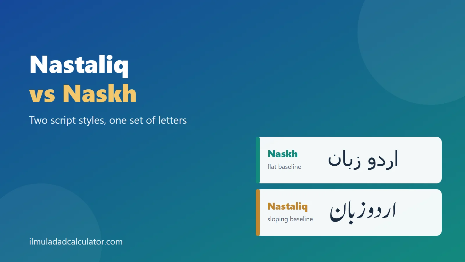
Nastaliq and Naskh are two styles of writing the same Arabic-script letters. Naskh sits on a flat line, while Nastaliq slopes downward in a flowing diagonal. Urdu is usually written in Nastaliq, and Arabic books and screens mostly use Naskh.
What Is the Difference Between Nastaliq and Naskh?
Both are hands of the Arabic script, so they share the same letters. The difference lies in how those letters are drawn and arranged on the line.
Naskh is small, rounded and upright. Nastaliq is long, fluid and tilted, and its name comes from a Persian phrase meaning a “hanging” naskh.
For a wider tour of calligraphy hands, see the guide to Arabic calligraphy styles. This page stays focused on these two.
How Do the Two Styles Look Different?
Five visual cues separate the styles. Once you know them, you can tell one from the other at a glance.
| Cue | Naskh | Nastaliq |
|---|---|---|
| Baseline | Flat and horizontal | Sloping, with words stepping down to the left |
| Overall shape | Compact and rounded | Stretched and flowing |
| Line height | Fairly even | Tall, with deep tails that need extra space |
| Letter forms | Up to four forms per letter | Many letters take more forms, since shapes depend on the next letter |
| Typical feel | Clear and plain | Graceful and poetic |
Remember: a style is a way of drawing letters, not a different alphabet. The letter ب is the same letter in both.
Where Did Each Style Come From?
The Story of Naskh
Naskh is a small rounded hand that served everyday copying and record keeping. Sources link its early use to the first centuries of the Islamic calendar.
Later it was set out in the system known as the Six Pens. Scholars link that system to the scribe Ibn Muqla.
The Story of Nastaliq
Nastaliq developed in Iran, with scribes in cities such as Shiraz often named in the story. Its name is a short form of a Persian phrase for “hanging naskh.”
The name joins two words. It blends naskh with taliq, an older Persian hand, as the page on Arabic calligraphy styles also notes. Taliq means “hanging”, which explains the slanting look.
The Library of Congress describes Nasta’liq as common to Ottoman Turkey and Safavid Persia.
Later writers in Iran credited Mir Ali Tabrizi, who lived from about 1360 to 1420, with inventing it. Modern scholars are more careful, and many see a slow change over several generations.
One account says he gave the style a fixed set of rules rather than creating it from nothing. Either way, his name is tied to the moment the style became a script in its own right.
Why Did Urdu Choose Nastaliq?
Nastaliq became the favorite hand for Persian poetry from the 15th century. From Iran it moved east, and in India it was adapted to write Urdu.
Persian was a court language across much of South Asia. Urdu grew up beside it, so the Persian way of writing was a natural fit.
Today most Urdu documents use Nastaliq. The same style is also used for Persian, Punjabi in Pakistan, Pashto, Balochi, Kashmiri and Saraiki.
Urdu also added letters of its own. See the Urdu and Arabic alphabet comparison and the count of Urdu letters.
Where Is Each Style Used Today?
Each style has its own home. The map is not strict, and many readers see both every day.
Typical Uses of Nastaliq
- Urdu newspapers, magazines and books
- Urdu poetry collections and calligraphy art
- Shop signs, posters and titles in Pakistan and India
- Persian poetry and decorative writing
Typical Uses of Naskh
- Arabic books, textbooks and newspapers
- Default fonts on many screens and in software
- Small text, such as tables and menus
- Early digital Urdu, where Naskh was easier to build
Naskh became the usual screen choice because its upright shapes are simpler to code. Even so, Nastaliq remains the main calligraphic style for Urdu.
Why Is Nastaliq Harder to Put on a Computer?
In Nastaliq, the shape of a letter depends on the letter that follows it. The text also stacks and slopes across several levels, instead of running along one line.
Fonts must avoid overlapping dots and marks while keeping the joins smooth. The SIL team behind the Awami Nastaliq font describes Nastaliq as much harder to render than the flatter Naskh.
This is why digital Nastaliq arrived late. The Noori Nastaliq typeface of 1981 used over 20,000 ligatures.
The InPage program of 1994 then gave Pakistani newspapers a Windows layout tool. Before such tools, many papers relied on hand calligraphers.
Unicode does not encode Nastaliq as a separate script. It is shown by choosing a Nastaliq font for ordinary Arabic-script text.
Which Fonts Show Each Style?
Fonts are how most people meet these styles today. The list below names some well-known examples from the sources.
| Font | Style | Note |
|---|---|---|
| Noto Naskh Arabic | Naskh | Open font from the Noto family |
| Amiri | Naskh | Often used for Arabic books and web pages |
| Scheherazade New | Naskh | Made for Arabic-script languages |
| Noto Nastaliq Urdu | Nastaliq | Open font for Urdu text |
| Awami Nastaliq | Nastaliq | Free font from SIL |
| Noori Nastaliq | Nastaliq | The 1981 digital pioneer |
Every one of these fonts draws the same letters. Swap one for another and the words stay put, though the look changes at once.
Web designers often list a Nastaliq font first and a Naskh font second. That way, a visitor without the first font still sees readable text.
How Did Urdu Printing Change With Technology?
Nastaliq was hard to set in metal type. For a long time, many Urdu newspapers and books relied on hand calligraphers.
Hand-written pages kept the full beauty of Nastaliq. They were also slow to produce, and every page needed a skilled writer.
Digital fonts changed the pace of work for Urdu publishers. Today an editor can type a page in minutes. A designer can switch between Nastaliq and Naskh with one click.
Some readers miss the hand-written look, and some modern Nastaliq fonts try to copy it. Others like the clean, even page that a Naskh font gives on a small phone screen.
How Does the Style Affect Reading and Typing?
Typing is the same in both styles. You press the same keys, and the font decides how the letters look.
- Type your text on any Urdu or Arabic keyboard.
- Pick a Nastaliq font such as Noto Nastaliq Urdu, or a Naskh font such as Noto Naskh Arabic or Amiri.
- Add extra line spacing for Nastaliq, so the tall shapes do not collide.
- Check the result on a phone and a laptop, since fonts differ by device.
If a device lacks a Nastaliq font, it falls back to another font. Your Urdu text then appears in a plainer Naskh-like style, with the same letters.
Readers tend to find their own style easiest. Urdu readers are used to Nastaliq, while Arabic readers are used to Naskh.
Does the Style Change Abjad Values?
No. The Ilm-ul-Adad system counts letters, not their drawing. A word in Naskh and the same word in Nastaliq give one total.
Here is the working for the word Urdu, using Mashriqi values:
ا 1 + ر 200 + د 4 + و 6 = 211
Differences can still appear when two keyboards use different code points for look-alike letters. Examples are Urdu ک and Arabic ك, which both count as 20. The page on why values differ covers this in more detail.
You can test any word with the Abjad value calculator. Paste it in either style and compare the totals.
How Can You Tell Which Style You Are Looking At?
Three quick tests work on almost any sample. You do not need to read the words to apply them.
Test 1: Follow the Line
Draw an imaginary line under the letters. If it runs flat across the page, you are probably seeing Naskh. If each phrase drops toward the left, it is likely Nastaliq.
Test 2: Look at the Tails
Naskh tails are short and tucked in. Nastaliq tails sweep out and down, and they often reach under the next word.
Test 3: Look at the Spacing
Naskh lines are packed evenly, so a page looks like a tidy grid. Nastaliq words overlap and nest, so a page looks more like flowing water.
Keep in mind: these tests describe the usual look. A skilled calligrapher can bend any rule for effect.
What Do Learners Often Get Wrong?
Three ideas come up again and again. Each one is easy to correct.
- Nastaliq is not a language. It is a way of writing, and it serves Urdu, Persian and several other languages.
- Naskh is not only for Arabic. Early digital Urdu was often set in Naskh, so you may meet Urdu in this style on older sites.
- The style does not fix the spelling. The same word is spelled the same way, and only the drawing changes.
Good font choice helps with all three. A site that serves Urdu readers should set the language to Urdu, so browsers choose a suitable font.
Which One Should You Learn First?
Start with the style of the language you read. For Urdu, that is Nastaliq, and for Arabic it is Naskh.
The letters themselves are easy to learn in Naskh, because the shapes are simple and clear. Many learners then move to Nastaliq once they know the alphabet. See the Urdu alphabet in order for a start.
Letters that never join the next one look different in each style but behave the same. The guide to non-connecting letters explains how.
خلاصہ
نستعلیق اور نسخ عربی رسم الخط کے دو انداز ہیں اور دونوں میں حروف وہی رہتے ہیں۔ نسخ سیدھی لکیر پر چلتا ہے، جبکہ نستعلیق ترچھا اور بہتا ہوا ہوتا ہے۔ اردو عام طور پر نستعلیق میں لکھی جاتی ہے، اور عربی کتابوں اور اسکرینوں پر زیادہ تر نسخ نظر آتا ہے۔ انداز بدلنے سے ابجد کی قیمت نہیں بدلتی۔
Sources and Further Reading
- Nasta’liq, World History Encyclopedia. The sloping, hanging look, the Mir Ali Tabrizi debate, the comparison with naskh and the spread to India.
- Awami Nastaliq, SIL Global. Why Nastaliq is harder to render than the flatter Naskh.
- Urdu Nastaliq digital typing, TIME. Letter shapes that depend on the next letter, and why early digital Urdu used Naskh.
- Nastaliq, Wikipedia. Origins, scholarly debate, languages, Noori Nastaliq (1981), InPage (1994) and Unicode.
- Naskh (script), Wikipedia. Early use, the Six Pens, the flat baseline and common Naskh fonts.
- From Your Hand to Heaven, Library of Congress. A Nasta’liq panel common to Ottoman Turkey and Safavid Persia.
- Abjad values come from this site’s tested engine. See the methodology.
Frequently Asked Questions
Is Nastaliq harder to read than Naskh?
It depends on habit. Urdu readers find Nastaliq natural, while new learners often find Naskh clearer.
Do Nastaliq and Naskh use different letters?
No. Both write the same Arabic-script letters. Only the drawing and spacing differ.
Why do some Urdu websites use a Naskh-like font?
Early digital Urdu often used Naskh because its upright shapes were simpler to build. Nastaliq needs far more complex fonts.
Who invented Nastaliq?
Tradition credits Mir Ali Tabrizi, who lived around 1360 to 1420. Many scholars think it developed over several generations.
Does the style change the Abjad value of a word?
No. The value comes from the letters, so one word gives one total in either style.